 I love color. “Well, du-uh,” you say.
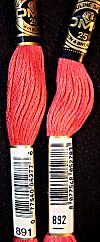
Did you know that the Color of the Year for 2011 is Pantone 18-2120 Honeysuckle? Pantone says, “A dynamic reddish pink, Honeysuckle is encouraging and uplifting . . . instilling the confidence, courage and spirit to meet the exhaustive challenges that have become part of everyday life.” Bring on the Honeysuckle! My computer’s color rendering is not perfect, and I don’t have access to Pantone’s precise colors, but I’m calling DMC 891 and 892 close enough. If the color of the year were beige or tan or brown, I’d ignore it, but I’ll embrace Honeysuckle.
I’m not a trend follower. That is, I don’t adjust my wardrobe or home decor or accessories to match seasonal trends. All right…all right…those of you who know me well can pick yourselves up off the floor now: that laugh-drool is not becoming. Ahem. As I was saying, I don’t follow trends. I do, however, love looking at and playing with different color combinations, and color forecasts, like paint-chip cards, are a good source of color inspiration.
Fire Mountain Gems & Beads has a nice page with past and present color forecasts. If you click around, you can find various color collections, like the one on the right-hand side of this page, showing a spring/summer 2011 color collection called “The Seducer.” How much do you think I love that one?
 I think it’s fun to interpret the color collections in embroidery floss. One of the fall/winter 2011-12 collections is called “Technical Guide.” It’s my favorite of the three fall palettes shown here, and these are the DMC colors I’ve chosen to create my version of the collection (3804, 470, 726, 3837, 3812, 806). I admit it’s not much of a creative stretch for me; although, left to my own devices, I would have gone for a brighter blue and yellow.
My goal is to make a bookmark with these colors. Can I persuade you to do the same? Find a color palette you like, interpret it in embroidery floss, stitch up a bookmark, and share it with us here.
Who’s in?
Categories: Needlework


These colors are yummy!
Hmmm… I really think of honeysuckle as more of a pale yellow than a reddish pink. We had yellow honeysuckle flowers around home and school when I was a kid. I remember pulling the flowers off and eating the “honey” nectar inside!
I was surprised by the red/pink, too. The honeysuckle I grew up with was white and yellow. And we sipped the nectar, too!
Yellow and white is what I recall, too. We sipped nectar as well.
You know, Pantone is the world’s color authority.
🙂
I had to google up the Honysuckle word to know what you talked about. And you know what: I am used to the name Caprifoliaceae and the color I am used to is a pink/red with some soft white color.
Pantone does know what they talk about 😉
And so do you, because Honysuckle comes in a huge variety!
We had two different types in the garden: one gave flowers and scent in Mai and the other one in August. The last one was more red in the color and flowered again and again… and had a growth for 2 m at least each summer. It was so eager to take over the garden, and the garden of the neighbor too…
Anyway, The Pantone Honysuckle color is something on my wish list (My next T.Box from JFW).
I have a large Panton Color System for Print with all colors – I love that thing. I have to up-date it, but that is very expensive, so I always hope to get a new “old” one from a Print studio 😉 and use my money on crafting-materials in stead…
Best regards